Why Painted Lines Make a Court Easier to Read
Painted lines make a court easier to read by clarifying boundaries and shared play areas, helping players recognise where each game begins without adding visual clutter.
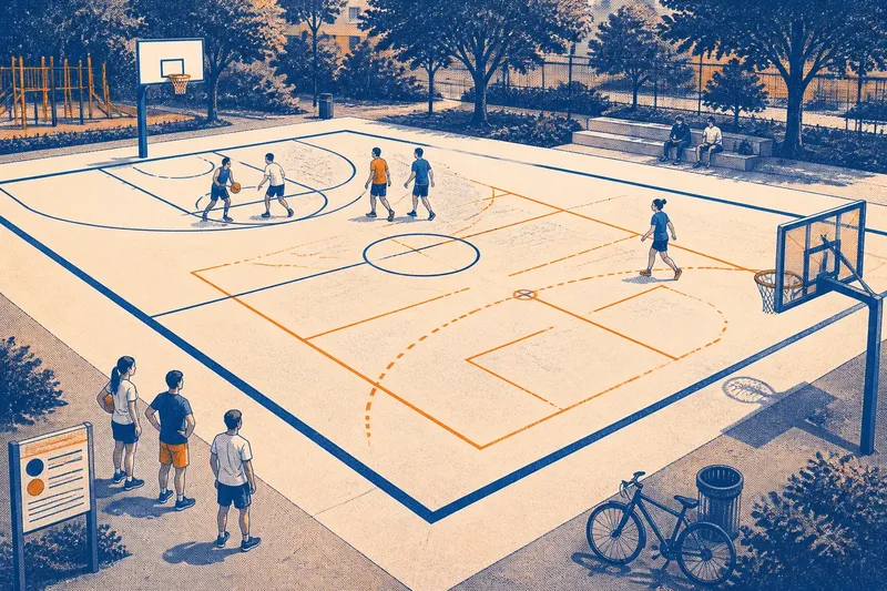
Painted lines make a court easier to read when each mark tells players something useful before they act. A clear boundary, a recognisable key and a distinct shared zone can prevent hesitation; a thicket of competing stripes does the opposite. The useful question is not how many lines fit, but which visual cues this court needs.
Contrast, spacing and consistency work together. Contrast makes a line visible against the surface. Spacing helps separate markings. Consistency lets players learn what a colour or pattern means and recognise it across the court. Choose among those priorities according to who uses the space and how many activities share it.
Use strong contrast on courts with mixed users
If players include children, occasional visitors or people unfamiliar with a sport’s rules, make the main boundary the easiest mark to see. Use a clear, continuous line in a colour that stands apart from the surface. A vivid mark on pale concrete may work; the same paint on weathered tarmac may disappear into it.
Contrast is not simply a matter of choosing the brightest colour in a paint chart. Look at the court from the places where decisions happen: the baseline, sideline, shared entrance and edge where players wait. A line that looks distinct from above can fade at a shallow angle or in changing light. Check the surface in both dry and damp conditions if the court is used in both.
For a court mainly used by one organised group, familiar colours and an established layout may matter more than making every mark visually dramatic. On a schoolyard or neighbourhood court with casual turnover, a simple, obvious perimeter is often more useful than extra detail. In either case, the principal boundary should not compete with decorative graphics, cracks or a second set of nearly identical lines.
Separate markings on shared courts
When several sports use one surface, fitting each layout is only part of the problem. Players need to tell which line belongs to which activity while moving, looking sideways or watching the ball. Where boundaries cross, different colours, line weights or patterns can help separate them. Keep each visual system consistent across the court.
Spacing matters even when the court’s physical dimensions cannot change. Avoid placing a secondary line so close to a primary boundary that the pair reads as one broad mark. Where lines must meet, keep crossings tidy and use colour distinctions that remain visible on the actual surface. A legend at the entrance can help first-time users, but it cannot rescue markings that are hard to distinguish during play.
Say a neighbourhood court has a familiar basketball layout and a smaller game area marked across it for occasional use. The organisers assign the secondary boundaries a contrasting colour and make them visually lighter than the main perimeter. A new player can then identify the primary court at a glance while still finding the smaller area. The expected observable result is less uncertainty about which line applies, not a change to the games themselves.
There is a limit to how much a shared court can comfortably carry. If several layouts require lines that cross repeatedly or sit almost on top of one another, consider whether one activity can use removable markers during its session instead of permanent paint. Not every available line deserves to become part of the scenery.
Keep cues consistent where players decide quickly
Lines signal where a player may stand, where a play begins or ends, and where one activity’s space meets another’s. A recurring colour or pattern can make those rules easier to recognise, provided the same cue means the same thing throughout the court.
Keep the most important cues visually distinct. A strong solid boundary can mark the court’s edge; a different, clearly recognisable treatment can mark a secondary area. Avoid relying on subtle differences such as similar shades or a barely noticeable change in thickness. Those distinctions may be obvious on a plan and much less obvious to someone tracking a moving ball.
Consistency also applies to interruptions. If a line disappears beneath a repaired patch, a bench or a painted logo, players may read the court differently on either side. Keep signs, murals and sponsor graphics away from places where they could be mistaken for a boundary or obscure a useful cue. The court should explain itself while attention is on the game, not demand a close inspection beforehand.
Limit visual clutter on small or informal courts
A compact court has little spare surface for visual noise. If children use it for flexible games, or residents invent activities that do not follow a formal layout, a bold perimeter and a few deliberate internal cues may be enough. A dense grid can make the space seem to have rules nobody agreed to follow.
For an informal play area, decide whether each additional marking helps users organise a game. A centre line may support dividing teams; a small target or service mark may suit a particular activity. If a mark serves only one occasional game, removable cones or chalk may be more adaptable than permanent paint. If a formal league layout is required, follow that sport’s recognised specification instead of improvising its geometry.
On a multi-use surface beside a playground or public path, visual restraint also helps distinguish the court from the spaces around it. A continuous outer boundary signals that play is happening within a particular area. It should not suggest that a path or waiting area is part of the playing surface. Use the site’s layout and signs to keep those functions legible.
Answer common questions about painted court lines?
What should I prioritise on a single-sport court?
Make the main boundary and the sport’s essential internal cues easy to distinguish from the surface. Familiar geometry and clear line continuity usually matter more than extra colours or decorative detail.
How should I mark a court used for several sports?
Give each activity a consistent visual identity, using distinct colours or line treatments that remain legible where markings cross. Keep the most-used layout visually dominant, and leave out a layout that makes the court hard to read.
Are coloured lines better than white lines?
Neither is automatically better; the surface and surrounding marks decide. Choose a colour that contrasts with the court in its real lighting and remains distinct from the other line colours already present.
When should I avoid adding another painted line?
Leave it off when it repeats an existing cue, crowds a more important boundary or serves a rare activity that can use temporary markers. A simpler surface is easier to understand than a complete-looking one whose markings compete.
Check the court before committing to paint
Before settling on a layout, walk the court from a player’s viewpoint and identify the decisions the markings need to support. Look for worn paint, patches, drains, posts and nearby graphics that could interrupt a line or confuse its meaning. A paper plan can show whether dimensions fit; a full-size chalk outline can reveal whether the arrangement reads clearly on the ground.
- Check the main boundary from the baseline and sideline; if it fades against the surface, choose a higher-contrast colour, otherwise keep it as the primary cue.
- Check where different sports’ lines cross; if they merge visually, change the colour or treatment, otherwise retain the consistent layout.
- Check whether a secondary line sits close to a primary boundary; if the pair reads as one mark, move or omit the secondary line, otherwise keep the separation.
- Check worn paint, repairs, drains and posts along each route; if an obstruction interrupts a cue, adjust the layout, otherwise proceed with the planned line.
- Check whether signs, murals or logos resemble court markings; if they could confuse players, move or simplify the graphic, otherwise leave it in place.
- Check whether an occasional activity needs a permanent marking; if not, use removable cones or chalk, otherwise include its line only if it remains legible beside the main layout.
Imagine a neighbourhood court with a faded basketball boundary, a crossing line for an occasional game and a drain near one corner. The organiser first chalks the proposed boundary and checks it from the baseline and sideline; it disappears against the worn surface, so they choose a more distinct colour. They then mark the occasional game’s lines in a contrasting, lighter treatment; at one crossing the marks still merge, so they shift that segment away from the basketball boundary. Finally, they move the corner line clear of the drain and decide to use removable cones for a rarely played activity. The resulting plan gives the main court a readable perimeter, keeps the second game identifiable and avoids adding a permanent mark where it would crowd the surface.
Agree on a visual hierarchy before choosing colours: identify the primary boundary, secondary areas and optional markings. Keep that order consistent in drawings and on the finished surface. If users cannot tell two activities apart without stopping to consult a sign, revisit the colours, spacing or number of permanent lines.
Paint type, surface preparation and line dimensions depend on the court material, product instructions and rules for the sport being marked. Check the manufacturer’s guidance and the relevant sport’s governing body before work begins; seek specialist help where the surface or specification calls for it. A tidy layout is of little use if the paint is unsuitable for the ground.
For a confusing court, start with its most important boundary, then review each shared zone and internal mark against the same test: can a player recognise its purpose quickly from the place where a decision is made? Clear painted lines are not decoration with administrative duties. They are a small piece of public design that lets attention stay on the game. When planning painted court lines, spend effort on how each cue reads from the court, not on adding a mark merely because there is room for it.